About 16 minutes
War, 52 Carey Cartoons — Background and Themes
Architecture
3,524 recorded words. 1 minutes difference from this book's estimate.
View Gutenberg source #67566
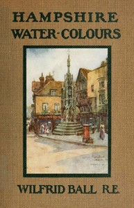
The catalog record for Hampshire Water-Colours — Story, Setting & Ideas provides practical reading context through 3,252 words, 15 min estimated reading time, and 1 detected text section.
The text analysis averages about 23.4 words per sentence, while the detected sections provide another way to judge how the source is divided.
Project Gutenberg metadata also associates the work with “Watercolor painting -- England,” connecting these edition facts with the source record’s subject description.
Explore this collection
These alternatives are selected using recorded categories and estimated reading time.
About 16 minutes
Architecture
3,524 recorded words. 1 minutes difference from this book's estimate.
View Gutenberg source #67566About 19 minutes
Architecture
4,327 recorded words. 4 minutes difference from this book's estimate.
View Gutenberg source #62934About 28 minutes
Architecture
6,360 recorded words. 13 minutes difference from this book's estimate.
View Gutenberg source #65955Search stored excerpts and compare books → Choose by your preferences →
Choices use stored catalog measurements. Estimates vary with reading speed. A shared category is a catalog label, not a claim that two books have the same argument or literary quality.
Search reads excerpt text stored with this catalog and links to its associated Gutenberg record. The connection is stored in the site database; this tool does not recheck that every excerpt is word-for-word identical to that external record. Excerpt search does not cover every chapter and does not verify historical publication dates.
Catalog snapshot checked: 2026-09-25. Coverage: 94 public books, 94 available source excerpts.
Read the complete public-domain text at its original source.
Read on Project GutenbergWilfrid Ball's Hampshire Water-Colours (1913) presents twenty plates of the county's architecture and scenery, from Winchester College to the Test Valley. The work's structure is deceptively simple: each plate is titled with a place name, and the captions often specify a viewpoint or building. Yet the sequence reveals a deliberate rhythm, alternating between urban landmarks and rural scenes, and between close-up architectural studies and wider landscapes. This note examines how the arrangement, captions, and the absence of descriptive prose shape the reader's experience, treating the plates as a visual narrative rather than a mere catalogue.
The order of plates follows a loose geographical arc, beginning in Winchester and moving outward. The first three plates—Tower of College Chapel, Winchester, Church of St. Lawrence, Winchester, and Middle Gate, Winchester College—establish a concentrated focus on the city's medieval and collegiate architecture. Then the view opens to the Itchen river at Chilland Mill, a transition from stone to water. Subsequent plates alternate between market towns (Romsey, Christchurch, Ringwood) and coastal or riverine scenes (Lymington, Beaulieu Village, Portsmouth from Gosport). This alternation prevents monotony and mirrors the variety of Hampshire's topography. The final plate, High Street, Winchester, returns to the starting city, creating a circular structure that implies a completed tour. The captions themselves are terse, often just a place name, leaving the viewer to infer the relationship between images.
Ball's captions are notably sparse. Unlike many contemporary illustrated works, there is no explanatory text, no historical anecdote, no artist's commentary. Each plate is titled with a location and sometimes a specific building or viewpoint, such as West Gate, Southampton or Sheet Mill, near Petersfield. This restraint forces the viewer to attend to the visual details: the play of light on stone, the reflection in water, the silhouette of a gate. The captions function as labels, not interpretations. They anchor the image in a real place but do not prescribe meaning. This economy of language is consistent with the watercolour medium itself, which often suggests rather than exhaustively describes. The viewer is invited to supply the narrative, to imagine the sounds and smells of each location.
The pacing of the plates is carefully managed. Early plates are dense with architectural detail—the tower of College Chapel, the intricate facade of St. Lawrence—demanding slow, close looking. Mid-sequence plates such as Romsey and Christchurch offer broader vistas, allowing the eye to rest. Later plates like Upton Grey and Headley introduce rural scenes with fewer man-made structures, shifting the focus to trees, fields, and sky. The final plate, High Street, Winchester, returns to an urban setting but with a more open composition than the opening plates. This variation in pace—from dense to sparse, from architectural to natural—creates a rhythm that mimics a day's journey: starting with close observation, expanding to panoramas, and ending with a familiar street. The absence of dates or seasons in the captions leaves the temporal setting ambiguous, though the quality of light in several plates suggests late afternoon or early morning.
Readers may find it rewarding to view the plates in sequence, noting the shifts in subject and composition. The lack of written commentary is not a deficiency but an invitation to engage directly with Ball's visual choices. Consider how the arrangement of plates creates a sense of movement through Hampshire, and how the captions—minimal as they are—guide without dictating. This work rewards repeated looking, each pass revealing new details in the watercolour washes and the relationships between adjacent images.
There’s a quiet patience in Wilfrid Ball’s Hampshire plates, each caption a held breath between water and stone. It reminds me of leafing through Wood Carvings in English Churches I. Stalls and Tabernacle Work. II. Bishop's Thrones and Chancel Chairs. — A Closer Reading, where every groove in the oak seems to wait for someone to notice it properly. Some books simply ask you to look longer, not faster.
Build a private reading journal entry for this title.